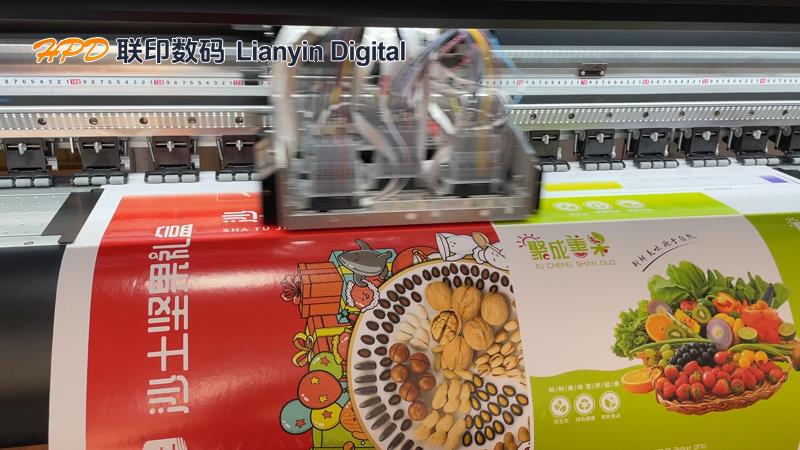
There are various processes and technologies in modern printing, such as offset printing, gravure/relief printing, flexographic printing, screen printing, etc., which are suitable for large-scale printing needs. However, the current popular digital printing can achieve direct output printing without the need for plate making. But no matter what type of printing method is used, there are always some colors that are the most difficult to print. Do you know what are the most difficult colors to print in the printing industry? Today, Lianyin Digital will give a brief introduction.
1、 Gray balance is one of the most difficult aspects to control in printing. Gray balance refers to the process of generating neutral gray by adjusting the dot area ratio of the yellow, magenta, and cyan color plates during printing and printing. This concept is particularly important in the printing industry because according to the theory of subtractive color rendering, the combination of the maximum saturation of C, M, and Y primary color inks should result in black, while equal amounts of different saturation levels produce different shades of gray.
However, in reality, ink has defects in hue, saturation, and brightness. Why? Because in reality, it is impossible to make ink as perfect as the three primary colors in a computer, so that an equal amount of three primary color ink cannot achieve the neutral gray you desire. This process is influenced by various factors, including the amount of ink used, paper type, full page density, dot area, overlay effect, and screen line count. These factors work together to make gray balance a challenge for testing the accuracy of printing machines and the skills of operators, which most tests the experience and skill level of operators.
In color management, gray balance involves controlling the correct reproduction of colors by adjusting the CMYK ink volume, ensuring that gray balance is crucial for avoiding issues such as color cast and color skipping. That's why color management is important.
2、 When it comes to high coverage multi-color dot stacking, such as over 70% dot coverage, certain specific colors such as dark brown, coffee, dark green with a large amount of blue components, dark blue, and purple blue, etc., due to color differences, it is difficult to achieve the ideal balance state in the printing process.
3、 Four color overlapping with missing spaces is also difficult to print. Excessive multi-color extremely fine lines and extremely small letters are difficult to print, requiring extremely high demands on the paper gripper of the machine. This is also a common issue, so pre press designers must check whether black text, especially small text, is only present on the black version of the publication file before outputting, and should not appear on other three color versions. If it occurs, the quality of the printed product will be greatly reduced. When converting RGB graphics to CMYK graphics, black text will definitely become four-color black
4、 When printing large areas of spot colors or areas close to full page, using reversed white text or repeating the same logo and color blocks often makes it difficult to maintain consistent colors, leading to issues such as color differences, ghosting, smudging, or scratches. If allowed, spot colors can consider using spot color ink to avoid color differences caused by color overlay printing.
High quality printed materials need to have the following characteristics: precise overprinting, uniform ink color, full dots, good ink balance, no printing defects such as dirt, scratches, patterns or paste, and faithfully reproduce the original manuscript. Pursuing these high standards helps to meet the growing aesthetic demands and ensure that the final product achieves the expected results.